Barbara Flueckiger
- Introduction
- A Digital Humanities Approach to the Analysis of Film Color Aesthetics
- Case Study I: Visual Complexity in MORTE A VENEZIA
- Case Study II: Reduced Legibility and Disorientation in BLACK NARCISSUS
- Case Study III: Mood Lighting and Affective States in JIGOKUMON
- Final Remarks
- Bibliography
- Filmography
Introduction
Affective and emotional cues in films have been neglected for a long time, but are now attracting increasing attention: partly from a neuro- or cognitive psychological perspective, partly with a phenomenological approach, or based on concepts from philosophical aesthetics.
The notion of expressive movement was introduced by Hermann Kappelhoff (2004) within a decidedly aesthetic theory, and with a focus on the melodrama as one of the most prominent genres for addressing spectators affectively, emotionally and bodily.
Consequently, Kappelhoff and a team of interdisciplinary associates conducted further research on emotions within the context of the cluster of excellence Languages of Emotion.
In their 2014 text, Thomas Scherer and Hermann Kappelhoff provide a thorough overview on the theoretical underpinnings and aesthetic configurations associated with the notion of expressive movement:
film can be analyzed not only on the level of narrative plot and character constellation, but as complex affective dramaturgy, in other words, as a temporal course that the spectators experientially go through. Furthermore, within the development of a scene, audio-visual images unfold as movement patterns structuring dynamically the process of watching. The way a scene unrolls in complex aesthetic figures of soundscapes, light changing, montage sequences, or camera work reveals a certain dimension of movement that realizes itself only in the perception of the spectator. Such an aesthetic addressing of the perceptive, affective, and comprehending activity of the spectator can be understood as cinematic expressive movement. (Scherer / Greifenstein / Kappelhoff 2014: 2081 f.)
Surprisingly, color is missing from the range of aesthetic parameters that shape the temporal unfolding related to the modulation of spectators’ affective responses. In three previous texts (Flueckiger 2016, 2020, 2021 [in press]) I have already integrated the concept into the analytic and theoretical framework for research on film colors as established with my team in my recent projects.
In contrast, this essay presents three fundamental configurations in which color shapes the perception of temporal patterns in film. To this end, it connects conceptual and analytical reasoning with digital humanities tools, as established both by Cinepoetics with the video annotation software Advene, and in ERC Advanced Grant FilmColors with the visual analysis and annotation system VIAN connected to the online portal VIAN WebApp (see https://blog.filmcolors.org/2018/03/08/vian/ and Flueckiger / Halter 2020).
Film translates choreography and staging through mise-en-scène into temporally unfolding interactions of color, space and light. Camera angle, field size, costume, set design, and illumination are strongly intertwined in shaping color appearance not only in single shots, but even more so when set in motion. One of the most basic and persistent building blocks in this web of interconnections is the relationship between figure and ground. Color attribution, color contrasts, textures, patterns, materials and surfaces influence the aesthetics of figure–ground relationships in complex and ever-changing ways.
For instance, the high angle in Luchino Visconti’s SENSO (IT 1954) stages the characters against an agitated, coarsely-checkered floor to express inner tension when the heroine is on the verge of confessing her love affair to her husband, thereby expressing her inner feelings through the mise-en-cadre of the décor.

By contrast, Jean-Luc Godard’s sober modernist style places the famous, endless marital dispute in LE MÉPRIS (FR 1963, see Sharits 1966 for analysis of the scene) through motion of characters and camera into an interplay between saturated blue and red furniture against white walls, with an ironic undertone reminiscent of the French tricolore.
As elaborated in a previous paper (Flueckiger 2020), Jacques Demy, Godard’s contemporary from the Rive Gauche, builds on changing arrangements of protagonists in bold colors in front of expressly manufactured, saturated and heavily patterned wallpapers in clashing hues, to underscore the emotional changes of the mother-daughter relationship in LES PARAPLUIES DE CHERBOURG (FR 1964). Similar to SENSO, characters in WEST SIDE STORY (Jerome Robbins / Robert Wise, USA 1961) are dressed in desaturated or pastel costumes, but they are staged against colored, often translucent and glowing backgrounds or pools of intensely colored light.
A Digital Humanities Approach to the Analysis of Film Color Aesthetics
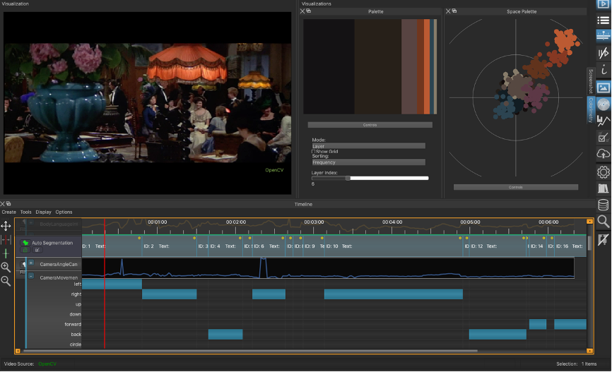
In ERC Advanced Grant FilmColors, our team and I analyzed a large corpus of more than 400 films with a computer-assisted workflow. The workflow included a video annotation software, initially ELAN, later replaced with the custom-made visual analysis and annotation software VIAN developed by Gaudenz Halter (Halter et al. 2019). Manual analyses were subsequently executed with a range of FileMaker databases that combined filmographic data with a glossary of around 1 200 theoretical and analytical concepts. Each movie was parsed into temporal segments with consistent color schemes and subsequently annotated based on the controlled vocabulary as defined in the glossary database.
The massive amount of data – more than 500 000 summations and around 170 000 screenshots resulting from the analyses – was processed externally and then reimported into an evaluation DB, again connected to the filmographic database, the glossary database and the master analysis database.
In parallel, Gaudenz Halter developed the portal VIAN WebApp, which extends the web of databases with a host of visualization and query methods, all of which are open to researchers for interactive exploration on shot, temporal segment (micro), film (meso) and corpus level (macro). Queries combine verbal methods with visual analytics. Visualization methods take human color perception into account by relating color values to the perceptually uniform color system CIE L*a*b*. Early in the project, we established figure–ground separation with deep learning tools, so that each of the visualizations is available for figure and ground separately (see more detailed information Flueckiger et al. 2017 and Flueckiger / Halter 2020).
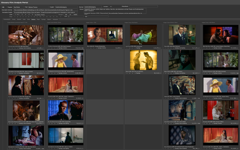
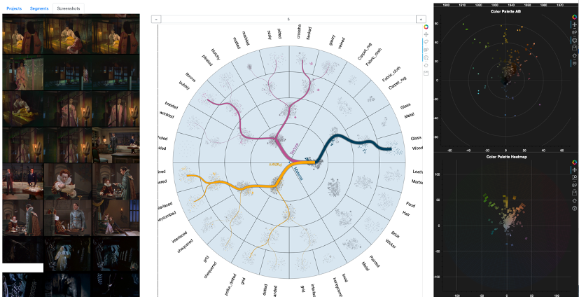
Increasingly, screenshots have become essential elements not only for the illustration of specific concepts, but also for the creation of hypotheses and for testing hypotheses with heuristic evidence. Both on the VIAN WebApp, and in the master, corpus and glossary databases, screenshots are gathered and rendered to support the evaluation of the analyses. Fig. 5 displays the entry expressive movement in the Glossary DB, with options for organizing the screenshots with reference to period, subcorpus, priority or typology.
Case Study I: Visual Complexity in MORTE A VENEZIA
Increased visual complexity often mirrors protagonists’ stressful moments, thus transmitting them to viewers who are induced to decipher the complex pictorial and spatial arrangements. Even in a 1940s American mainstream musical such as MEET ME IN ST. LOUIS (Vincente Minnelli, USA 1944), the heroine is suddenly placed behind the grid of her polished, shiny brass bed when she is in emotional distress.

In terms of color distribution, visual complexity is created either by an abundance of variegated colors, or by a reduction thereof. Color schemes are either limited to only a few shades in tone-on-tone or restrained modes, or they include saturated elements as distractors with pop-out effects or as multicolored contrasts of hue. In both cases, the cluttered mise-en-scène displays several layers of spatial arrangements, usually with obstacles placed in the foreground, which obstruct the view and increase the levels of variation with high spatial frequency at smaller to small scale. Protagonists tend to vanish in these arrangements and are often placed in the background, which makes it even more difficult to follow them.
Staging remains at the center of the mise-en-scène in Luchino Visconti’s films, as briefly shown with the example of SENSO above. Characters are choreographed in complex ways related to space, lighting and camera perspective, which constantly change the figure–ground relationship.
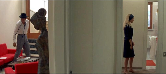
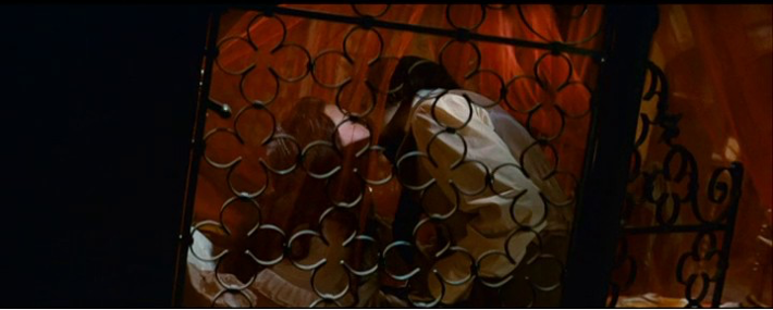
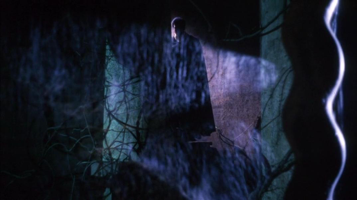
In Visconti’s MORTE A VENEZIA (IT 1971), the elderly protagonist’s complicated and forbidden desire for the beautiful young boy, Tadzio, is often expressed in long, searching camera movements combined with visual complexity. Colorful objects in the foreground—notably vases, low-hanging lamps and colorful accessories—stand in the way of both the protagonist’s gaze and the visual perspective of the mise-en-cadre, thus obstructing the search for the protagonist’s love interest. Camera movements are slow and anthropomorphic (Brinckmann 1994); they indicate an invoked presence (Nielsen 2007) of an anonymous observer wandering through the hotel lobby. In terms of narrative perspective, we experience an alignment (Smith 1995) with the protagonist: the invoked presence follows him and then the camera takes over his point of view.
 Clip 1: Expressive movement in MORTE A VENEZIA (Luchino Visconti, IT 1971), scene 9, 00:22:02:08 to 00:29:57:21.
Watch this clip on Vimeo, password: Cinepoetics_2021
The VIAN colorimetry and analysis show the conflictual, dissonant contrast of hue and split complementary contrast, with a clash between orange and a muted shade of teal in combination with dusk pink. A dash of violet blue behind the vase becomes increasingly visible when the camera moves to the left.
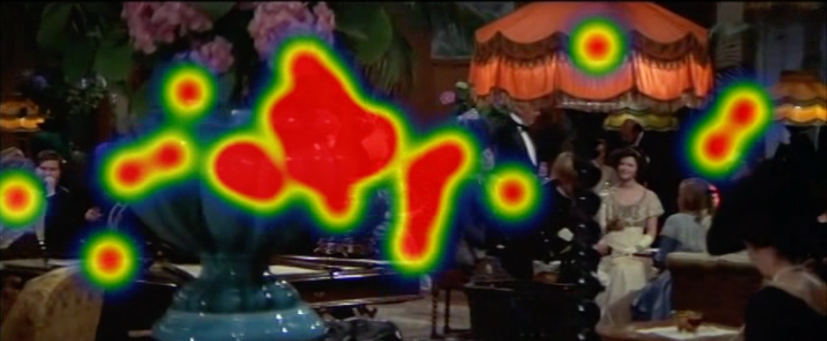
In their eye tracking study conducted within ERC Advanced Grant FilmColors, Miriam Loertscher and Bregt Lameris investigated a set of exemplary figure-ground relationships with specific types of color distribution, among them the temporal segment from MORTE A VENEZIA discussed here. The corresponding heatmap confirms the split attention caused by colored and more saturated objects in the foreground that obstruct the view and distract from the characters dressed in desaturated and muted costumes in the background.
Textures and surface properties are important parts of color appearance. We tend to think of colors as pure hues somehow attached to objects and environments. However, as David Katz noted in his 1911 phenomenological study Die Erscheinungsweisen der Farben and elaborated in his 1930 textbook Der Aufbau der Farbwelt [translated as The World of Colour, 1935], we should take surface variations much more into account when discussing colors. In her article about the phenomenology of colors, Anya Hurlbert (2013) elaborated how color distribution across an image conveys a myriad of material and surface properties that address—through the visual system—our haptic perception.
Hard, soft, slimy, muddy, fluffy surfaces create distinctive color patterns through the three-dimensional variations of objects’ surface structures and textures, and are intensified by the properties of the incident, scattered or reflected light.
Luchino Visconti is known for his artful work with colors, surface properties, and textures in particular; see for instance the hard shiny vases in the foreground in both SENSO and MORTE A VENEZIA that are associated with the protagonists’ sense of being at odds with his societal environment.
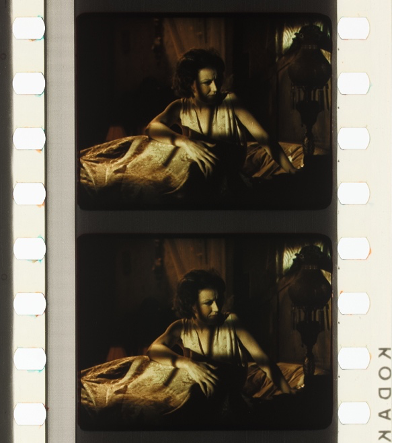
In A SINGLE MAN (USA 2009) the attraction of Tom Ford’s gay protagonist’s love interest is palpable through his fluffy creamy pullover (see Kirsten Moana Thompson’s in-depth analysis in Thompson 2015), while the muddy streets in STALKER's (Andrei Tarkovsky, SU 1979) Zone indicate the barren environment of a dystopian landscape.
For the investigation of textures, materials and surfaces, Gaudenz Halter recently developed an additional deep learning tool with Sankey diagrams for the exploration of the films analyzed and visualized through the VIAN WebApp with a promising, browser-based architecture (Halter et al. 2021 [unpublished manuscript]).
For instance, in the search displayed in Fig. 14 we applied a dominant focus on fabrics, colored illumination, and layers, based on the analysis of segments with expressive movements from the VIAN WebApp.
Case Study II: Reduced Legibility and Disorientation in BLACK NARCISSUS
By combining complex arrangements with darkness, various patches of colored light and/or patterned shadows, spatial legibility is further reduced by blurring the objects’ and characters’ boundaries, which adds to the disorientation of both the characters and the viewers.
In the Italian giallo I TRE VOLTI DELLA PAURA, there are many sequences with reduced legibility that combine spiderwebs, diffusion, darkness, colored lighting into an overload of distractors to support an eerie atmosphere and a sense of disorientation.
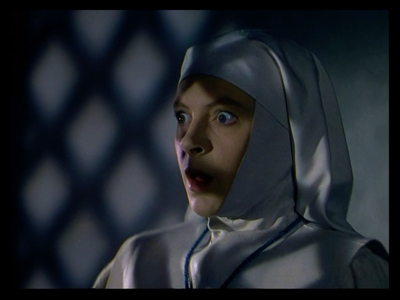
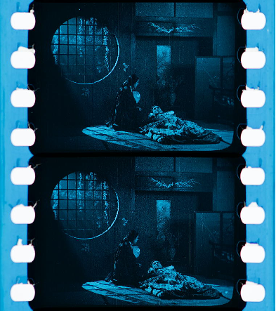
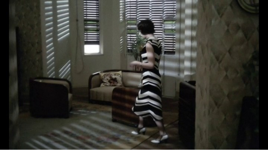
In BLACK NARCISSUS (Michael Powell / Emeric Pressburger, GB 1947) the sensually and erotically charged environment depicts an increasingly disturbing atmosphere in a convent for women in the Indian Himalayas.
At the climax of the film, the emotional eruption of erotic desire takes place in a dimly-lit environment with moving candles. By falling through patterned screens called jali or mashrabiya the candle flames project geometrical shadows onto the nuns’ plain light ecru habits. The patterned shadows in this scene – so-called cookie lighting – dissolve the shapes of the characters in progressively frenzied motion, enhancing the visual momentum by combining the moving characters and camera movement.
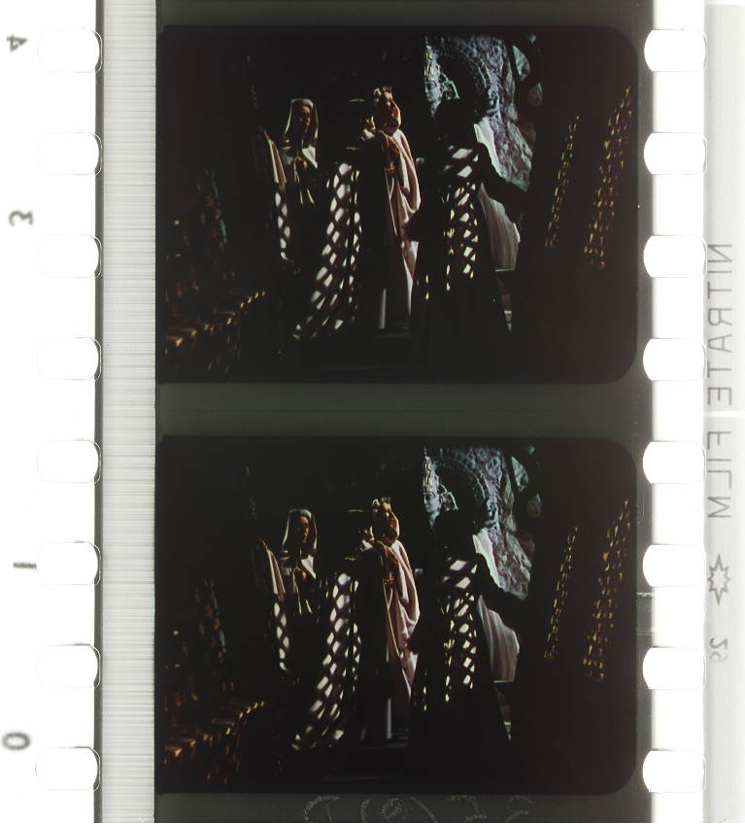
Apart from the red lipstick and dark red burgundy dress of the escaping nun, only some dashes of yellowish candlelight are small, saturated patches at the beginning of the sequence, giving way to an almost completely desaturated, slightly blue and dark color scheme when the nuns rush through the corridors of the monastery.
 Clip 2: Expressive movement in BLACK NARCISSUS (Michael Powell / Emeric Pressburger, GB 1947), scene 46, 01:23:28:19 to 01:25:17:04.
Watch this clip on Vimeo, password: Cinepoetics_2021
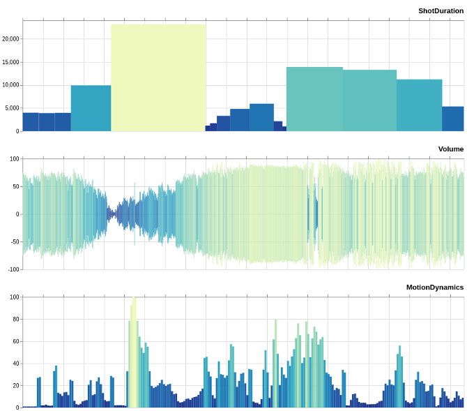
Several different types of analysis and visualizations display the special status of this sequence and its temporal unfolding. With the Color_dT visualization of the luminance for figure and ground over time, we provide evidence that this is indeed the darkest scene of the entire film.
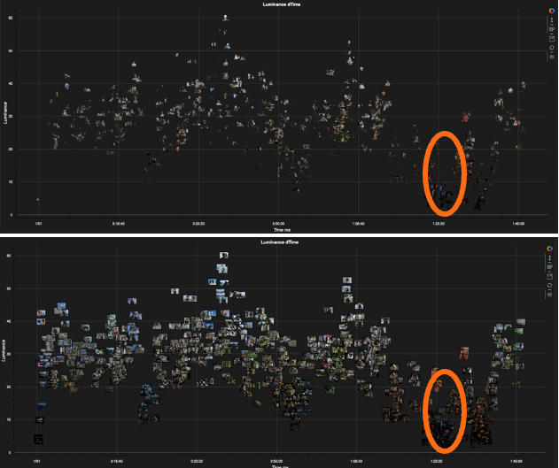
Shot duration, sound volume and motion dynamics underline the relationship between movement, rhythm and sound. Preceding the motion frenzy in the dark, there is a moment of silence, an effect that in my investigation of sound design I called circus effect as it foreshadows the outburst of action with characters and camera moving in a longer take (Flueckiger 2001).
Shadows are a second case in point that add an extra layer to visual compositions, often in order to create and evoke a certain atmosphere. In part, shadow effects are conventionalized stylistic means, such as the hard cast shadows on walls that literally foreshadow unpleasant events looming in the future.
These cookie lighting patterns mimic effects as created by foliage, architectural details such as window frames or in this case by the ornamental, geometrical mashrabiya screens mentioned above. Cookie lighting has been used since the 1910s. From the early days of Technicolor, patterned shadows played an important role in color cinematography, such as conveyed in DOCTOR X (Michael Curtiz, USA 1932), in an ostentatious mode that contradicts general notions of self-effacing professionalism in Classical Hollywood and its unobtrusive continuity style.
Complex illumination patterns affect the figures’ unity up to the point where they are hardly discernible, not only in the scene from BLACK NARCISSUS discussed here, but also for instance in IL CONFORMISTA (Bernardo Bertolucci, IT 1970), where the striped cookie lighting created by Venetian blinds overlaps with a correspondingly striped costume. Even more pronounced is a drug-induced hallucination scene in THE TRIP (Roger Corman, USA 1967) where the shadow patterns are enhanced by projections of colored illumination (see Lameris 2019 for an extended discussion).

Case Study III: Mood Lighting and Affective States in JIGOKUMON
Colored or mixed lighting has been a stylistic device to express feelings and create atmospheres in tune with characters’ emotions since the introduction of Technicolor No. III in the late 1920s – contrary to the widely-held notion that it was an intermedial transfer from the theater stage introduced by set designer Robert Edmond Jones for LA CUCARACHA (Lloyd Corrigan, USA 1934) in Technicolor No. IV.
Mood lighting (see Keating 2010) is a technique which bathes an environment in an expressive ambiance with colored lights, in order to connect the mood of the characters with spectators’ perceptions, in an affectively laden mode of attunement.
While in the 1930s mood lighting sometimes connected direct affect (Plantinga 2009) with color conventions, thus still adhering to narrative functions as suggested by Technicolor’s color consultant Natalie Kalmus, this subordination to story soon gave way to more complex and ambiguous applications of mood lighting, often occurring below the threshold of perception and most likely eluding cognitive evaluation by spectators.
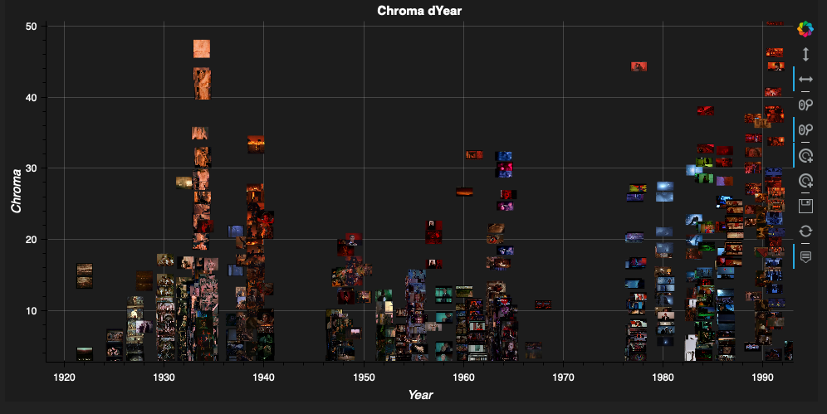
Mixed lighting that combines blue light traditionally associated with night scenes with yellow tungsten light seems to be one of the most robust variants of mood lighting within a longer historical period. Mixed lighting is often connected to emotional situations where protagonists are experiencing challenges, are troubled by doubts or by imminent threats. Fig. 27 shows the color distribution with a strong dominance of red and a little less in the blue range. Occasional green illumination is overstated in the Palette Dot Plot on the right, while the heat map on the right-hand side renders the proportions more faithfully. Color distribution throughout the whole period from 1920 to 1995 indicates the rise of mood lighting in the late 1920s with Technicolor No. III, a further occasional application with Technicolor No. IV and V with less chroma, while colored illumination in the service of mood lighting becomes more saturated with chromogenic film stocks after the mid-1970s.
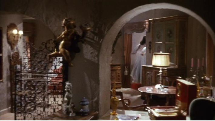
Closeness and distance in 地獄門 [JIGOKUMON; GATE OF HELL] (Teinosuke Kinugasa, JP 1953) are staged in a complex mode set in the sparse, geometrical arrangement of a Japanese house, where subtly colored semitransparent curtains and pools of light provide the changing background colors in tune with the heroine's mounting emotional struggle, most evident in the scene discussed here, in which she conceals her brutal plan to have herself killed in lieu of her husband.
![Figure 27: Color_dT saturation over time for figure (above) and ground (below) in scene 45 of JIGOKUMON [GATE OF HELL] (Teinosuke Kinugasa, JP 1953). Visualization by Noyan Evirgen.](http://medien.cedis.fu-berlin.de/loe/mediaesthetics/ausgabe_04/flueckiger/flueckiger_fig20.png)
Curtains are a significant device to underscore the expressive movement in JIGOKUMON, as I have discussed in more detail in my recent paper Textures, Patterns, and Surfaces in Color Films (Flueckiger 2021, in press; for an extended analysis of JIGOKUMON see Street 2018). By dividing the three-dimensional space into planimetric layers, the semitransparent curtains invoke the film medium’s genuine ambiguity with regard to representations of spatial features of various degrees of depth and flatness – a phenomenon which has been noted since the early days of cinema (Münsterberg 1916, see Schweinitz 2016 on art historical concepts relevant to the phenomenon in the films of the 1910s).
Embroidery on the curtains adds to the painterly and haptic appearance and considerably supports the impression of spatial layering. By whitening or darkening the color appearance of costumes, objects and environment, they add additional geometrical patches within the sparse Japanese architecture. Modelling illumination, on the other hand, enriches the characters with roundness and spatiality.
As Sarah Street writes, inspired by Giuliana Bruno’s work on ‘haptic materiality’ (2014):
As has already been indicated, the film’s fine and varied costumes, for example, constitute material expressions of the characters’ psyches, of their histories and changes in circumstance across the narrative. Bruno refers to ‘connective fabrics’, or how clothes become affective metaphors that are profoundly related to mood and psychology. (Street 2018: 22)
Wind is a second consistent signifier in JIGOKUMON, established in the first scene. It sets the curtains in motion, again related to the female protagonist’s mental states and the inner turmoil that she carefully tries to hide from her husband and her social environment.
As a third element that adds to the projection of feelings into the environment, mood lighting bathes the architectural space in a shift between warm and cold hues that metaphorically stand for the tension caused by the heroine’s conflicting emotions.
![Clip 3: Expressive movement in 地獄門 [JIGOKUMON; GATE OF HELL] (Teinosuke Kinugasa, JP 1953), scene 45, 01:06:29:04 to 01:08:02:12.](http://medien.cedis.fu-berlin.de/loe/mediaesthetics/ausgabe_04/flueckiger/flueckiger_clip03_startbild.png) Clip 3: Expressive movement in 地獄門 [JIGOKUMON; GATE OF HELL] (Teinosuke Kinugasa, JP 1953), scene 45, 01:06:29:04 to 01:08:02:12.
Clip 3: Expressive movement in 地獄門 [JIGOKUMON; GATE OF HELL] (Teinosuke Kinugasa, JP 1953), scene 45, 01:06:29:04 to 01:08:02:12.
Watch this clip on Vimeo, password: Cinepoetics_2021
In JIGOKUMON, the three stylistic and signifying systems — curtains, wind and mood lighting — contribute to the expressive movements as shown exemplarily in this sequence. Filled with despair after an assault by her oppressor, Kesa slowly wanders through the house. While she tries to hide her emotions, the dim cool blue lighting and curtains subtly moving in the wind project her feelings into the mise-en-scène. Her husband, cheerful and unaware of the situation, sits in a pool of warm yellow light. She tricks him into searching the house. Husband and wife are partially separated by the semi-transparent, partly embroidered drapes. The static, geometrical, layered and framed mise-en-cadre adds to the expression of the heroine’s heavy burden, as does the music, which starts with single xylophone accents accompanied by strings slowly progressing in minor chords while Kesa shuffles in slow steps in the background.
Final Remarks
In summary, colors in film are an often-overlooked but extremely noteworthy aspect of expressive movement. At the same time, expressive movement is a highly fruitful theoretical and analytical concept for the discussion of colors’ unfolding over time, related to staging, set and costume design in combination with lighting and camera movement.
Since the introduction of color to film, aesthetic features of colors and their arrangement within a film’s style have been powerful instruments for expressing moods and affective states in order to activate spectators’ bodily reception as well as their sensory and affective responses through movement and staging.
Bibliography
Brinckmann, Christine N.: Die anthropomorphe Kamera. In: Christine N. Brinckmann (ed.): Die anthropomorphe Kamera und andere Schriften zur filmischen Narration, Zürich 1994, pp. 277–301.
Bruno, Giuliana: Surface. Matters of Aesthetics, Materiality, and Media. Chicago; London 2014.
Flueckiger, Barbara: Sound Design. Die virtuelle Klangwelt des Films, Marburg 2001.
Flueckiger, Barbara: Farbe und Ausdrucksbewegung. Jacques Demys Musicals Les Parapluies de Cherbourg und Les Demoiselles de Rochefort. In: Film-Konzepte, 56, 2020 pp. 31–42. (https://www.zora.uzh.ch/id/eprint/185544/).
Flueckiger, Barbara: Color and Subjectivity in Film. In: Maike Sarah Reinerth and Jan-Noël Thon (eds.): Subjectivity across Media. Interdisciplinary and Transmedial Perspectives, New York 2016, 145–161. (https://www.zora.uzh.ch/id/eprint/126903/).
Flueckiger, Barbara; Evirgen, Noyan; Paredes, Enrique G.; Ballester-Ripoll, Rafael; Pajarola, Renato: Deep Learning Tools for Foreground-Aware Analysis of Film Colors. In: AVinDH SIG 2017 (https://www.zora.uzh.ch/id/eprint/153333/).
Flueckiger, Barbara; Halter, Gaudenz: Methods and Advanced Tools for the Analysis of Film Colors in Digital Humanities. In: Digital Humanities Quarterly, 14,4, Special Issue Digital Humanities & Film Studies. Analyzing the Modalities of Moving Images 2020. (http://www.digitalhumanities.org/dhq/vol/14/4/000500/000500.html).
Halter, Gaudenz; Ballester-Ripoll, Rafael; Flueckiger, Barbara; Pajarola, Renato: VIAN. A Visual Annotation Tool for Film Analysis. In: Computer Graphics Forum, 38,3, Jun. 2019, 119–129. (https://onlinelibrary.wiley.com/doi/full/10.1111/cgf.13676).
Halter, Gaudenz; Diehl, Alexandra; Flueckiger, Barbara; Pajarola, Renato: Clustered SankeyBridges. Multi-level Visual Exploration of High-dimensional Spaces 2021 [unpublished manuscript].
Hurlbert, Anya: The Perceptual Quality of Color. In: Liliana Albertazzi (ed.): Handbook of Experimental Phenomenology. Visual Perception of Shape, Space and Appearance, New York 2013, 369–394. (http://dx.doi.org/10.1002/9781118329016.ch15).
Kappelhoff, Hermann: Matrix der Gefühle. Das Kino, das Melodrama und das Theater der Empfindsamkeit. Berlin 2004.
Katz, David: Die Erscheinungsweisen der Farben und ihre Beeinflussung durch die individuelle Erfahrung. London 1911.
Katz, David: Der Aufbau der Farbwelt. Leipzig: Johann Ambrosius Barth.
Keating, Patrick: Hollywood Lighting from the Silent Era to Film Noir. New York 2010.
Lameris, Bregt: Hallucinating Colours. Psychedelic Film, Technology, Aesthetics and Affect. In: Cinéma & Cie. Special Issue Cinema and Mid-Century Colour Culture, 32,19, Spring 2019, 85–97.
Münsterberg, Hugo: The Photoplay. A Psychological Study. New York; London 1916. (https://archive.org/details/photoplayapsycho005300mbp, retrieved 09/08/2018).
Nielsen, Jakob Isak: Camera Movement in Narrative Cinema. Diss. University of Aarhus 2007 (http://www.academia.edu/6840868/Camera_Movement_in_Narrative_Cinema_2007_, retrieved 02/19/2017).
Plantinga, Carl: Moving Viewers. American Film and the Spectator’s Experience. Berkeley 2009.
Scherer, Thomas; Greifenstein, Sarah; Kappelhoff, Hermann: Expressive Movements in Audio-visual Media. Modulating Affective Experience. In: Cornelia Müller, Alan Cienki, Ellen Fricke, Silva Ladewig, David McNeill and Jana Bressem (eds.): Body – Language – Communication. An International Handbook on Multimodality in Human Interaction, Berlin, München, Boston 2014.
Schweinitz, Jörg: Bildreize zwischen Fläche und Raum. Visuelle Ästhetik deutscher Spielfilme in den 1910er Jahren und die zeitgenössische Kunsttheorie. In: Jörg Schweinitz and Daniel Wiegand (eds.): Film. Bild. Kunst. Visuelle Ästhetik des vorklassischen Stummfilms, Marburg 2016, 233–250.
Sharits, Paul J.: Red, Blue, Godard. In: Film Quarterly, 19,4, 1966, 24–29. (http://www.jstor.org/stable/1210398, retrieved 02/09/2016).
Smith, Murray: Engaging Characters. Fiction, Emotion, and the Cinema. Oxford, New York 1995.
Street, Sarah: The Monopack Revolution, Global Cinema and Jigokumon/Gate of Hell (Kinugasa Teinosuke, 1953). In: Open Screens, 1,1, Jun 2018, 1–29. (http://openscreensjournal.com/articles/10.16995/os.2/, retrieved 07/05/2019).
Thompson, Kirsten Moana: Falling in (to) Color. Chromophilia and Tom Ford’s A Single Man (2009). In: The Moving Image, 15,1, 2015, 62–84. (http://www.jstor.org/stable/10.5749/movingimage.15.1.0062, retrieved 08/24/2016).
Filmography
A SINGLE MAN (Tom Ford, USA 2009)
BLACK NARCISSUS (Michael Powell / Emeric Pressburger, GB 1947)
DOCTOR X (Michael Curtiz, USA 1932)
I TRE VOLTI DELLA PAURA (IT 1963, Mario Bava)
IL CONFORMISTA (Bernardo Bertolucci, IT 1970)
INDISCREET (Stanley Donen, GB / USA 1957)
JIGOKUMON [GATE OF HELL] (Teinosuke Kinugasa, JP 1953)
LA CUCARACHA (Lloyd Corrigan, USA 1934)
LE MÉPRIS (Jean-Luc Godard, FR / IT 1963)
LES PARAPLUIES DE CHERBOURG (Jacques Demy, F 1964)
LOLA MONTÈS (Max Ophüls, FR / BRD 1955)
MEET ME IN ST. LOUIS (Vincente Minnelli, USA 1944)
MORTE A VENEZIA (Luchino Visconti, IT 1971)
SENSO (Luchino Visconti, IT 1954)
STALKER (Andrei Tarkovsky, SU 1979)
THE DRAGON PAINTER (William Worthington, USA 1919)
THE TRIP (Roger Corman, USA 1967)
WEST SIDE STORY (Jerome Robbins / Robert Wise, USA 1961)